
Reviving an Architectural Icon in Belgium
- leenvandenbrande
- Feb 26
- 4 min read
Updated: Mar 2
In one of Belgium’s most exclusive residential villa districts, we were entrusted with the renovation of a remarkable home designed by a well-known Belgian architect, Pieter De Bruyne.
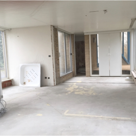
Although located in a prestigious and beautiful neighborhood, the property had stood empty for years. Without maintenance or care, a house of this scale and architectural significance inevitably begins to deteriorate. Several elements had fallen into such poor condition that removal was unavoidable; including a large steel-and-glass indoor garden structure and the original late-1970s kitchen and bathroom.
Our mission was clear: modernize the home and restore its quality, without erasing the distinctive architectural language of its era.
This was not about turning a 1970s home into a 2020s box. It was about refinement, respect, and intelligent transformation.

Entrance Hall & Living Area – Contemporary Yet True to Its Roots
The entrance hall and living room featured characteristic late-1970s elements, including exposed concrete ceilings and strong architectural lines.
By painting the walls and the concrete ceilings white, we softened the space and introduced a brighter, more contemporary welcome while preserving the brutalist character that defines the property.
The iconic sunken seating area in the living room, a typical design feature of that era, was carefully preserved. Rather than hiding the past, we enhanced it.
When architecture has personality, you work with it and not against it.


Kitchen – Reinventing a 1970s Classic
The original late-1970s kitchen featured a cooking island, visionary for its time, but unfortunately it was in very poor condition.
We replaced it with a modern interpretation that respects the original layout while elevating functionality and aesthetics. The wooden ceiling panels were removed to reveal the raw concrete ceiling structure above. This instantly gave the kitchen a contemporary, architectural feel and created cohesion with the rest of the home.
By exposing the concrete, we reconnected the space with the home’s structural DNA, something many renovations overlook.


Bathroom – Maximizing Space Through Design
The bathroom originally featured an enormous circular bathtub partially built into the wall. Dramatic, but not practical for modern living.
We replaced it with a walk-in shower featuring mosaic wall finishes and a transparent glass screen to maintain an open, spacious feel. The former single sink was upgraded to a double vanity, topped with a large horizontal mirror to visually expand the room.
Interestingly, despite the home’s impressive 600 m² surface area, this particular bathroom was relatively compact (the property includes three additional bathrooms). Therefore, maximizing spatial perception was essential.
This transformation demonstrates how intelligent layout decisions can completely redefine comfort, even within limited square meters.


Office Space – From Apartment to Autonomous Workspace
The house is built across three levels, with the top floor originally designed as a self-contained apartment, complete with its own bathroom.
We saw an opportunity.
By removing the internal partition walls, we transformed this level into one large, open office space. The sliding doors leading to the winter garden were replaced with fixed windows, allowing more natural light while improving insulation and functionality.
The existing bathroom was removed and replaced with a compact built-in kitchenette. This adjustment allows the office floor to function entirely independently from the rest of the home; ideal for professional use without disturbing the private living quarters.
Flexibility and autonomy significantly increase a property’s long-term value.


Study – Revealing the Structure
In the study, we removed the built-in cabinetry and dismantled the wooden ceiling finish to expose the original concrete structure.
By stripping away later additions, we restored clarity and authenticity to the space. The raw concrete ceiling once again became a defining architectural element, reinforcing the home’s late-70s identity in a clean and modern way.
Sometimes renovation is not about adding, but about revealing.

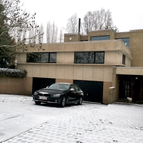
Exterior – Subtle but Powerful Updates
Surrounded by mature trees, the house naturally blends into its green environment. However, after decades without upkeep, the facade needed refreshing.
The original aluminum window frames had discolored over time into a dated aubergine tone. Rather than replacing them entirely, we repainted them in matte black. This simple yet strategic decision instantly modernized the exterior and sharpened the architectural lines.
The result is timeless, elegant, and far more aligned with today’s design expectations.


Garden – Letting the Architecture Breathe
Years of neglect had allowed trees and shrubs to overgrow to the point where the house was barely visible from the street.
By selectively removing certain trees and vegetation, we allowed the architecture to breathe again. Natural light now enters the house more generously, and the structure once again takes its rightful place within the landscape.
Good design is not limited to interiors, it extends to how a building interacts with its surroundings.


Modernizing Without Erasing History
This project required sensitivity, architectural understanding, and a clear design vision.
We modernized materials, improved functionality, and increased spatial clarity while preserving defining elements such as the sunken living area and exposed concrete structures.
The result is a house that feels contemporary yet authentic, refined yet respectful of its era.


Comments